7 Key UX Design Principles for Smooth User Journey

Ever thought of the role that designs play in perking up people? No wonder, a classic design has the power to cheer up a sad and desolate person. Whether it’s graphic design, interior design, product design, UI design, or UX design, all of them affect a person’s mood extensively.
It’s not just about the mood, design plays a big part in grabbing people’s attention and generating sales. An elegant product design, for example alone, can earn you sales only because it has fascinated a buyer. This write-up, however, will deal with UX design, more specifically its principles.
But before I dilate upon UX design principles, it’s weighty to pick up the concept of UX design. So, let’s have a look at the overview of UX design.
UX Design Overview:
To put it simply, UX design is how users interact with a product or a service. It’s a process of designing products or services to provide users with an optimal experience. UX design focuses on building products or services keeping utility, ease of use, and overall customer satisfaction in mind.
As per the stats of Toptal, 88% of users are less likely to return to a website after a bad user experience.
Irrespective of whether it’s a physical or digital product, UX design plays its part in product development. In the case of physical products, it’s about how you feel about touching or holding products. For digital products, UX design is how users feel online right from viewing a product till they access every part of it.
The primary goal of UX design is maximizing user contentment by leveraging products or services through cool appearance, usefulness, and efficiency.
Difference between UX and UI Design:
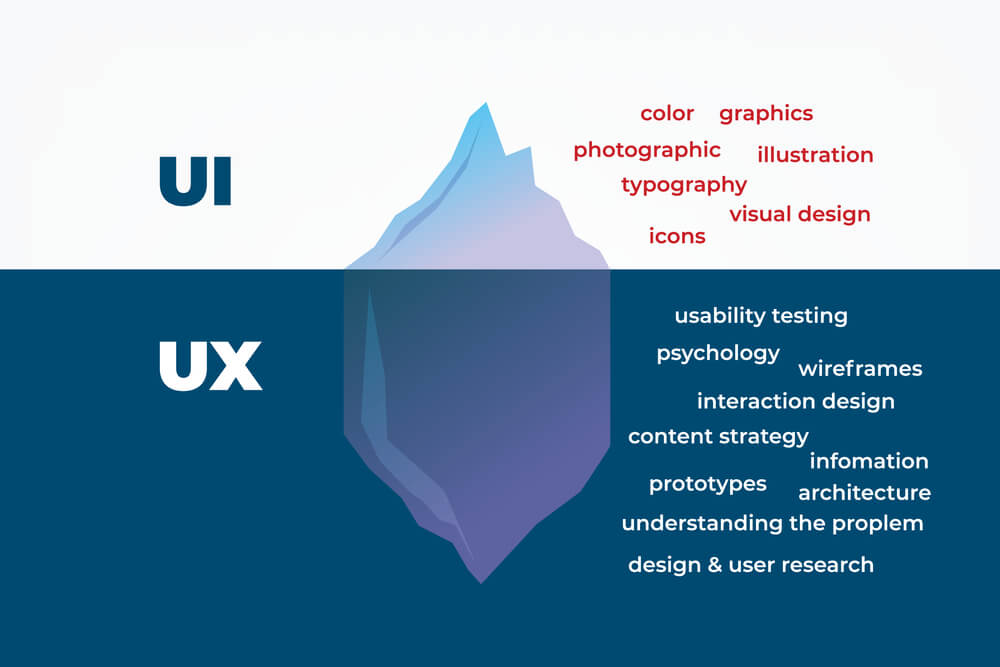
To many, UX and UI designs are a bit confusing terms. They fail to differentiate between both terms. UX design, as I mentioned above, pertains to the overall feel and experience of users. It primarily targets resolving the pain points encountered by users while using a specific product or service.

Contrarily, UI design is more of the visual look and function of a digital product. It primarily targets spicing up a product’s interface with different interactive elements like buttons, dropdowns, tabs, accordions, toggles, tooltips, scrollers, search bars, etc.
An example will clarify both these terms. Hypothetically, consider a house as a product; then the house’s bricks are your codes. UX design, in this case, will be the design of the house prototype, wireframe, and structure. And UI design will be the visual elements like room setup, ventilation, space availability, wall arts, carpets, furniture, electronics, etc.
7 UX Design Principles for a Seamless User Journey:
Now that we are done with the UX design overview as well as the UX and UI design differences. It’s time to jump to the core of this write-up at this point. Let’s have a gander at the 7 salient UX design principles straightaway.
You can implement these UX design principles for both digital product design as well as website design including WordPress websites.
Put the Focus on the User:
The prerequisite for the UX design of a product is putting yourself in the users’ shoes. That means you have to prioritize the preferences, feelings and views of the users. But it’s a common tendency among UX designers trying to satisfy their fellow designers.

With this approach, you can’t blow away your users as they are unlikely to get their preferred elements in the product. Needless to say, competent UX designers always tend to design products aesthetically. But their drive for perfection may lead them to lose empathy sometimes.
User-centricity underpins all other UX design principles and top-hole UX designers stress it before kicking off their designs.
Prioritize the Accessibility Factors:
We often emphasize product usability which no doubt is essential. Alongside, accessibility carries the same weight as it’s crucial for you as a UX designer to let everyone use your products.
What I mean by everyone is that even handicapped, disabled, and visually impaired people should have the luxury of using your products easily and smoothly.

For example, some people may have poor vision with difficulty reading on screen. You can use contrasting colors for the text on the background to ease their sighting and reading. Likewise, you can use underline for hyperlinks for people with color blindness.
Hierarchy Matters a Lot:
Hierarchy is something we often brush aside while designing a product. No matter whether its’ a website or an app, hierarchy plays a major part in ensuring a hassle-free journey. Hierarchy can be split into 2 categories- Information architecture and visual hierarchy.
Information hierarchy basically deals with the formatting of a website’s content. For example, when you visit a website or open an app, the first thing you usually note is a navigation bar. This bar includes a menu which is the primary hierarchy.
When you click or hover over the menu items, you will notice further subcategories providing you with more detailed information. This section usually will be a top-level hierarchy. Afterward, the bottom-level hierarchy follows including separate pieces of content, images, and cards.

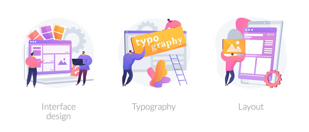
When it comes to the visual hierarchy, it’s something UX designers implement for ease of navigation. Based on this principle, the most important content should stand out. For example, titles and headings should show up larger than the body text, sometimes with bolding and using different fonts.
Likewise, interactive elements like buttons and links should appear in varying colors. This will grab the attention of the visitors and nudge them to take action.
Don’t Ignore the Consistency:
Maintaining consistency is one of the core requirements in UX design. This is because users always fancy leveraging products that have identicality to the products they regularly use. It may sound counter-intuitive but it’s actually handy for users.

When they find design similarities with their usual products, they don’t require to pump extra money to learn additional aspects of the design. Besides, it’s also useful for designers as they don’t have to reinvent the wheel, saving their precious time.
Focus on the Context:
When it comes to designing solution for user problems, context is another integral part of the design. That means you should have a holistic idea about your user base and you must consider the situation from which they can deploy your product.

Context can embody the devices your users use to access your product. It can also include the atmosphere they are in like whether they are in a serene environment or a clamorous environment. Also, invest time in making out users’ emotional state and the time they are likely to use the product.
Apart from that, you should also ponder over the fact of whether the product is intended for someone on the go or for someone sitting at the desk.
Inject Personality to your Design:
Ever wondered about the way you can intrigue users’ with your lifeless product design? Well, adding a character to your design can do the trick. Users tend to seek the human touch in the products they use as it’s very challenging to interact with an inanimate design.

So, carry out the necessary research and come up with a personality that can blow away your user persona. If users find the personality you add to your product design charming, they will have a superior user experience with your product.
Emphasize Typography:
If I say that an inappropriate selection of typography can botch an entire UX design, it wouldn’t be an exaggeration. Users tend to get swayed away by the style and appearance of text displayed on a website or a digital product.
Your product elements may be visually appealing and you might have provided access to all types of users. But if the text of your product shows up illegible and imperceptible, users are likely to get distracted from your product.
Eventually, your entire efforts to grip and retain users will go in vain. So, be choosy about the style, appearance, and fonts of your UX design.
What’s your Say:
Building a website or a product design idea apparently is a snap. But in reality, it requires days of hard work, effort, and research to produce a design. And to make mind-blowing designs, you have to be user-centric. This is where UX design principles will come into play.
You may think that a design can be built just by taking a look at a few products or websites. But in most cases, this tactic won’t work out. Designs built in this sloppy way can create a killer output but that’s one in a million case. That means it’s just a fluke. In most cases, your design will turn out bad and lousy.
To blow away users with your product design, there isn’t any alternative to following UX design principles. That will also bring out product design gems! Do let us know your take on UX design principles. Don’t hold back to suggest any other core UX design principle if you think I have missed out.
