7 Bad Website Design Examples with Lucid Errors

If you browse the Internet, umpteen websites you will find existing with eye-teasing designs. Once you land on these websites, you are likely to struggle finding desired information or navigating to the right area. So, that’s an example of a bad website design.
We often talk about designing stunning websites and share fruitful tips to do so. Undoubtedly, these tips come in handy before starting to design your dream website. But how often do we talk about bad website designs?
Don’t you think having ideas of bad website design is equally important as good website design? When you know how crappy website designs look upfront, you can easily refrain from applying those design actions to your website.
In this write-up, I have come up with 7 bad website design examples that will enlighten you about poor website designs. From these examples, you will pick up the dos and don’ts of website designs. These websites will also reflect website themes, bad UI and UX designs.
No matter if you are a pro web designer or an amateur, this write-up will be full of substance for you. Before I list out the 7 websites with poor designs, let’s get an overview of bad website designs.
How does a Bad Website Design Look Like:
So far, I mentioned bad website design a number of times. But how to know the traits of a bad website design? Well, there are some characteristics based on which you can fathom that it’s a poorly designed website.
Prior to listing out those characteristics, let me brief you that if a user lands on your website and finds difficulty to execute his/her task, it’s a sign that your site design is poor. The purpose of the user can be anything- trying to learn about your product, buying your product, or just creating an account.
Characteristics of a Bad Website Design:
- Cluttered layout
- Hidden navigation menu
- Absence of simple navigation links and buttons
- Lack of color contrast
- Non-responsive design (Like not mobile-friendly)
- Inconsistent typefaces making readability difficult
- Vague and confusing message
From these traits, I believe you can have substantial idea about bad website designs. These will help you to design imposing websites maintaining both UI (User Interface) and UX (User Experience) designs.
7 Bad Website Design Examples:
Out of thousands of websites with crappy designs, I have picked up 7 poorly designed websites that would provide you with an idea how the worst website designs look like. So, let’s take a look at the ins and outs of these websites.
Pacific Northwest X-ray Inc:
What comes in your mind looking at this site? Seems like an age-old site of 90s decade, right? No offence! This site shows up extremely low-grade in terms of appearance with flashy blue color. What makes the site eye-teasing is its incompatible texts and colors.
Font, colors, text size, and text position, all of them aren’t in sync with one another. Additionally, if you look at the website’s homepage, it does display a search bar, categories, and links. But they look untidy and outdated. The site also lacks some essential elements like navigation bar, sidebars, CTA button, etc.
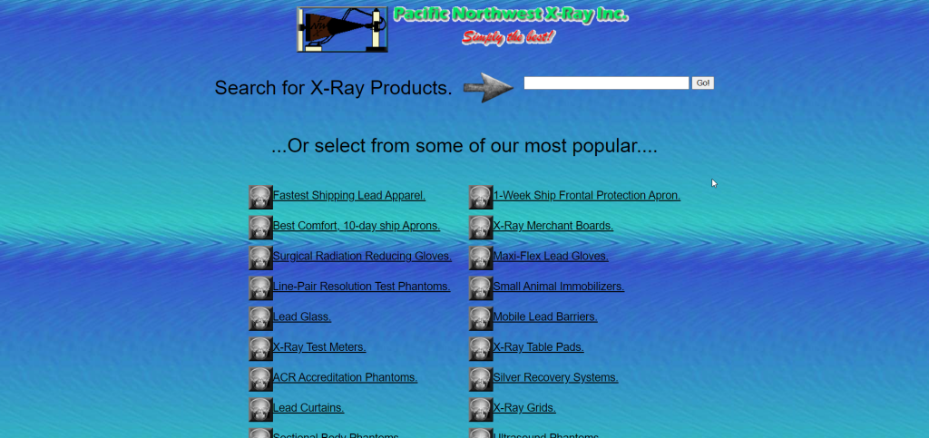
For this site to achieve the status of a top-notch site, it requires a complete makeover. Right from the content to the styling, all these segments need to be tweaked bringing a touch of modernism. Instead of gradient color, the site should utilize solid color.
The site must feature a navigation bar showcasing tabs like Home, About Us, Contact Us, etc. If the site sells products or services, this should also show up on the tab. The website should also make use of relevant and peachy visuals in addition to fixing typography and color.
What’s Wrong with the Site at a Glance:
- Crappy typography and mismatching design color
- Lack of content details
- Missing vital elements like navigation bar, menu, etc.
Suzanne Collin’s Books:
Unlike the previous site, Suzanne Collin’s site has a navigation bar with few tabs. But the navigation bar doesn’t look absorbing. In these days when there are countless tools to optimize site design, this site stands nowhere close to a picture-perfect site.
If you visit Suzanne Collin’s site, there is nothing in the site that would glue you to the site. First off, the content shows up entirely messy. The maximum portion of the homepage was taken away by one best-selling book titled “The Ballad of Songbirds and Snakes“.
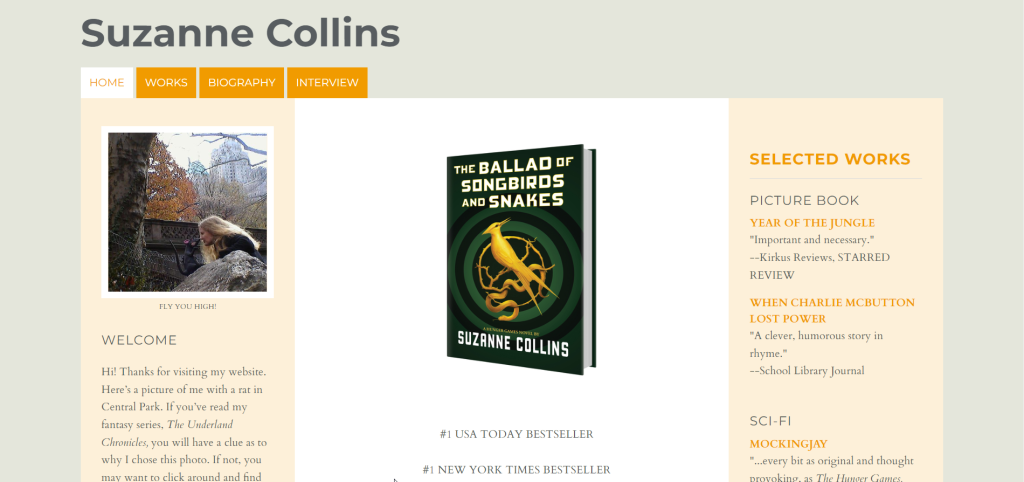
Excessive mentions of 1 book with monotonous descriptions and quotes have overshadowed the other aspects of the website. Apart from that, the site displays some links on the sidebar that literally don’t serve any function, rather causes visual disturbance.
Another major flaw on the site is once you click the “Work” tab on the menu, it displays the same list of books that show up on the sidebar. That’s terrible, right? Overall, Suzanne Collin’s website requires more relevant content, key elements, visuals, and proper formatting.
What’s Wrong with the Site at a Glance:
- Minimal text failing to convince visitors
- Site design too simple to attract visitors
- Visuals are unflattering
Arngren:
Arngren, a classified ad site is a perfect example of how disorganized a site can be. Right from the typography to the entire skeleton, the website looks cheesy and chaotic. The font of the copy is tiny, so much so that the texts appear illegible and difficult to go through.
The most irritating facet of the website is its layout. The images are placed too close to one another, creating a cluttered look. Apart from that, the navigation menu looks just sickening in a box with categories listed disorderly.
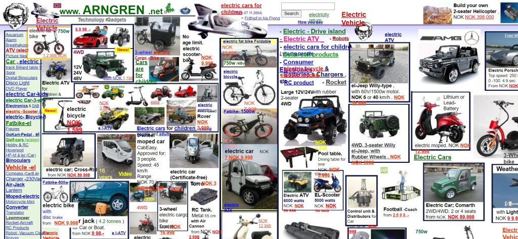
What makes these categories even worse is the inconsiderate color picking. Talking about color, it has become a laughing stock in the entire site. The site was designed mostly with red, blue, and black colors lacking harmony and consistency.
Another negative side of the website is the category listing. All the categories of the website show up on the menu making the site design complex, cluttered, and eye-teasing.
In order to make the site eye-pleasing, it requires a drastic modification to the entire site including the layout and content. All the parameters including colors and typefaces need to be optimized to get an optimum appearance.
What’s Wrong with the Site at a Glance:
- Difficulty in navigation
- Random and faddy use of colors
- Ridiculous choice of typography
- Absence of a clear message about the business
The World’s Worst Ever Website:
Looking at the website’s name, you get a clear impression of a bad site, right? The site was named such, maybe with the intention to bring extra traffic. Whatever the reason, the site definitely deserves to be rated as one of the worst websites ever.
The site displays flashy and dazzling colors, seemingly an intentional execution to get negative reviews about the website design. Not just color, even the font chosen for the site is full of garbage.

Another spoiler of the site is the redundant animation, causing distraction and forcing visitors to leave the site getting puzzled. Overall, the World’s Worst Ever website is an obvious display of fundamental website design errors.
The site needs a sweeping change in the text and background colors. Additionally, the text content needs to be organized and formatted properly to showcase a clear message.
What’s Wrong with the Site at a Glance:
- Font and text content issues
- Clashing colors of text and background
- No clear message of what the size is all about
- The site is entirely unformatted
The Big Ugly Website:
Like the previous website, The Big Ugly website also portrays negativity with its name. Needless to say, the purpose of this website is also to showcase a crummy site design. That’s why the site’s name was selected including words like ugly.
Theme, layout, item placement, and overall site design is awful. The noticeable aspect of the site is it’s a one-page website acting more like a landing page. But it contains many external links instead of promoting any particular product or service.
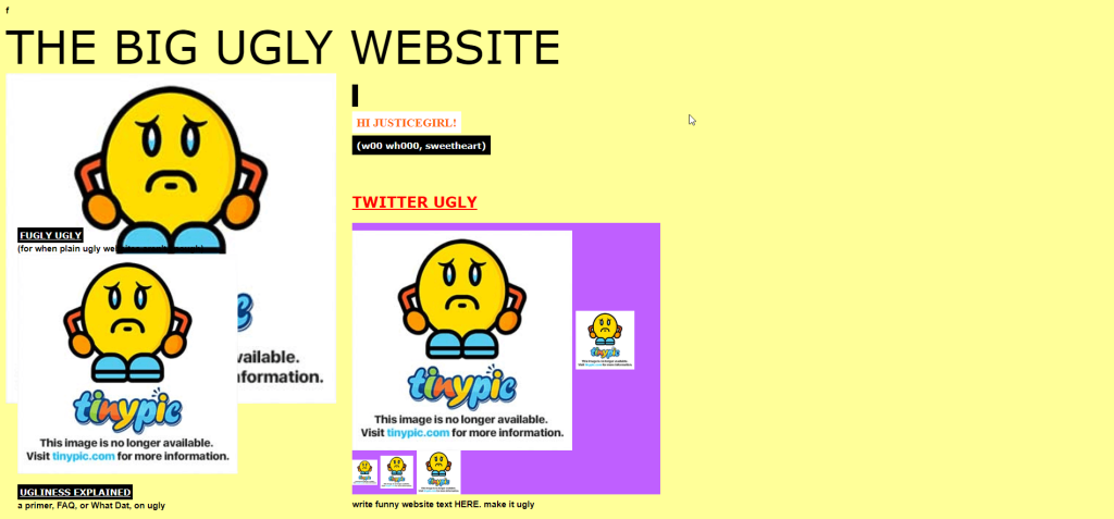
Apart from that, the website has a terrible navigation system, imperfect color schemes, and many broken links of images. The amount of design errors the site contains, it’s clearly one of the strongest contenders of bad design examples.
In order to fix the website design issues, the site needs to update and improve the color combination, navigation, font size, and external links.
What’s Wrong with the Site at a Glance:
- Formatting issues throughout the site
- External links of the images are broken
- Excessive highlights of the headers
- Website content lacks depth of information
Lingscars:
Lingscars means Ling’s cars, so Ling is the website owner. Her website is based on renting used cars on long term basis. That means the site clarifies what it’s all about. But the issue arises when it comes to the layout of the website.
The site looks horrible with cluttered elements, images, and gifs. The site displays useless animation of elements that does nothing but creates a distraction. The most sickening part of the website is the opening video that completely wrecks the site layout with its misplacement.
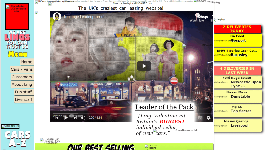
Apart from that, the overall color of the site is psychedelic teasing the eye. Some of the texts are totally unreadable due to their tiny size and inappropriate colors.
The first issue of the site to be dealt with is formatting. Images, videos, and other elements need to be positioned well to create an arresting layout. Aside from that, the site requires major tweaks in existing colors and typography.
What’s Wrong with the Site at a Glance:
- Color and typography issue
- Images, GIFs, and other elements show up cluttered
- Navigation system is poor and confusing
- Navigation menu links don’t work
Bella De Soto’s Website:
Bella De Soto’s website does something that hardly any website does. Once you land on the website, it auto-downloads a file on your computer. That’s not only irritating but also scary. Visitors are likely to panic seeing an unknown file being downloaded.
This website also has more objectionable stuff that you didn’t notice in the previous website design. And that’s the dimension (length x width) of the website pages. The pages are so long and wide that you will be sick of scrolling vertically and horizontally.
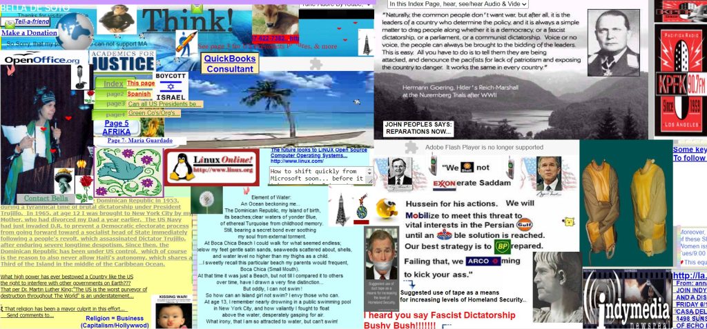
Even if you zoom out site pages up to 20%, you will fail to view the bottom-placed images lucidly. Additionally, the texts and images of the website are so closely placed that they clutter the entire site. Overall, the site is eye-teasing, distracting, and no doubt a strong contender to be listed this write-up.
In order to jazz up the site, the first action needed is to structure the content of the site. Both texts and images should be optimized and organized. Secondly, the site dimension should be scaled down to enhance the look and layout.
What’s Wrong with the Site at a Glance:
- Contains structural issues
- The site length and width are too large to view content evidently
- No navigation menu, complicating the site browsing
- Content color is incoherent
What’s your Take:
Being familiar with websites having classy and elegant designs is key. These sites will be instrumental to design your websites stunningly and strikingly. But you may wonder why should I know about bad website design. This is so that you desist from applying any trait of bad website design to your website.
With that in mind, I have crafted this write-up incorporating 7 bad website design examples. Hopefully, after going through the write-up and visiting these websites, you will get an absolute idea of how bad website designs look like and which themes you should use to design your site.
That’s all I had in this blog about bad website designs for you. Best of luck for your next website design and wishing that you would nail it after learning about all the traits of lousy website designs. However, if you decide to build your site with Elementor, you can avail ElementsKit, an addon for Elementor.