Accessibility in Design: 8 Factors to Know Before Designing for the Web
After the pandemic, people have excessively gotten dependent on the web. This pandemic made them think that how much online shopping or any activity can save energy, effort, and time. Therefore, they are relying more on the web.
However, the matter of concern is one-fifth of the world’s population is suffering from disabilities that cause problems while web interaction. Therefore, it’s high time we brought accessibility to design that most people ignore while designing web content.
That’s why today’s blog will be all about accessibility, its importance, and guidelines. So, dig in to find out the nitty-gritty about accessibility in design.
What is accessibility in design?
Accessibility refers to making the design understandable and available for people with disabilities and limitations. It ensures everyone understands the design without facing any difficulties. In simple words, accessibility means building tools, websites, and other products that can be understood or used by any person no matter how serious their disabilities are.
The definition of accessibility in UX design already gives you an idea of why it is needed for the web. If it is still unclear to you, go through the following section to find out why is accessibility important in design.
Why do you need to make designs accessible?

Creating easy-to-understand designs for disabled people is not the only purpose to bring accessibility to design. Along with it, accessibility allows you to target a wide range of people and market your products or services to them. Besides, it offers other benefits. Have a look at the necessities of accessible designs for your web:
- Since you can target a wider audience, there will more possibilities for conversion.
- Achieving business goals will be easier.
- Sales and ROI will increase.
- It offers a higher user experience as visitors can easily understand what you are conveying through your designs.
So, these are the reasons that will push you to create accessible designs for the web. Now, how about having fruitful accessibility design guidelines? It will be quite helpful, right? Keep digging to find the most effective accessibility guidelines.

8 factors to make accessible designs
Here we have researched all WCAG 2.1 resources and brought together the 8 best factors that help you to create accessible webpages, tools, and so on. So, check out the following eight factors and ensure accessibility in UX design:
Proper color contrast
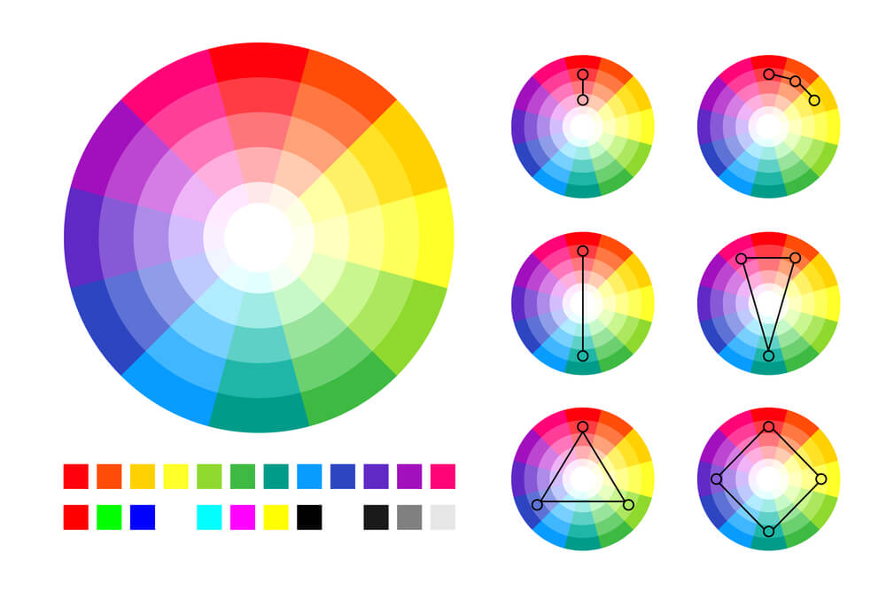
Color contrast refers to the difference in color and brightness between foreground and background color. According to web accessibility, it means providing content that can be readable even by a colorblind. It is recommended to use high-contrast color between the background image and the text so that it can be easily read. For the image, color contrast needs to be 4.5:1. Besides, this ratio is also the same for the normal text. Also, keep the color contrast 3:1 for bold or large text.
Your content will be readable for anyone if you maintain the above ratio for your text and image.
Readable content
Color contrast is not the only factor that can make content readable. In addition, you need to optimize and format content to increase readability. Follow the below guides to optimize content for higher readability:
- Try to use short sentences and paragraphs while writing content.
- Use headings and images to make content scalable.
- Don’t use complicated words in your content.
- Avoid using passive voice in the content.
Clear typography
To increase accessibility in design, you have to carefully choose the typefaces for your content as some are hard to read. Use Sans Serif fonts for making your content understandable. Apart from selecting readable Sans Serif fonts like Times New Roman, Arial, Calibri, etc, you need to keep a few things in mind. Such as:
- Don’t use different types of fonts in your content. Use one or at best two fonts for your content.
- Your font size should be 14-16 pt.
- Using animated text is not a good practice as it reduces content readability.
- Try to minimize the use of UPPERCASE and Italic styles for your text.
Time and motion adjustment
Most people add motion to their text for making content unique and sophisticated. But, while adding motion, they hamper the accessibility of the content. Thus, disabled people face difficulties reading your web content, and here the number of people who have vision impairment or blindness is 2.2 billion.
This destroys the purpose of writing web content as the chunks of the audience can’t read your content.
Control over video and audio

While uploading a video on the web, make sure it has a subtitle added to it. Besides, you should offer transcripts for video and audio content. Also, stop setting autoplay for videos as it might feel irritating to your audience. Give full control over playing and pausing videos and audio to your audiences.
Web accessibility also depends on the navigation of your site where you need to keep in mind the following points to create an accessible design:
- The page title needs to be descriptive.
- Add meaningful links and sitemaps to the websites.
- Menus should be added wisely so that anyone can understand what the page is all about.
- Pay special attention to page layouts and headings of the document.
🔔 Need guide to remove your page title in WordPress?
Go through the blog “5 easy ways to remove page title in WordPress“.
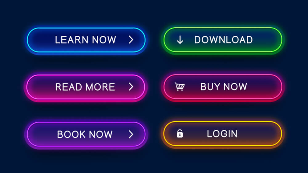
You must optimize every section of your website or content where CTA is one of the most important sections of your website. So, it needs to grab the attention of your visitor. Use large fonts and meaningful words to make your call-to-actions more converting. Besides, maintain proper color contrast otherwise your CTAs won’t be visible to your audience.
So, to increase accessibility in UX design, ensure you have maintained color contrast and font size well.
Non-text content
You should optimize not only text-based content but also non-text content for unlocking higher accessibility for your products, services, or sites. Now, to optimize these non-text content such as icons and images; you need to add these by following the below instructions:
- Use visible icons with related text so that anyone can understand the context behind using these.
- Must maintain color contrast for your non-text content.
- The icon size needs to be larger than the text.
- Don’t forget to add alt text for your non-text content.
Frequently asked questions
✅ Are accessibility and usability similar?
Accessibility and usability are not similar. Accessibility means making the web content and design understandable for everyone around the world including disabled people. On the other hand, Usability is completely connected to how a user interacts with your website.
To get higher usability, you need to ensure accessibility design guidelines are maintained properly. Simply, accessibility and usability are connected with each other. Without maintaining accessibility in design, your web content won’t get perfect usability.
🔔Want to check some bad website design examples?
Check out the blog “7 bad website design examples“
✅ What are the general accessibility issues?
Various accessibility issues can be faced by a user while interacting with your products and services. For example, people might have color blindness, mobility, auditory, and seizure issues that prevent them to interact with your product which can cause a big loss.
Now, to get over these accessibility issues, you need to follow the accessibility design guidelines that are discussed above. So, make your website not only thinking about your targeted audience but also about the users who have disabilities.
Wrapping up
Bringing accessibility to design is a great concern as a huge part of the world’s population is disabled. If your web content isn’t accessible, your market will get shrunk automatically. So, prepare your web design thinking about all the people around the world and make it as accessible & inclusive as possible.
And the good news is, you already knew how! Apply all the above-mentioned accessibility factors to your web content, product, or service one by one. Besides, you can also check accessibility design examples from the web to get more ideas about it. So, start taking steps to make more accessible web content or product.

