10 Best Landing Page Examples You Must See in 2025

Are you here to check out the best landing page examples to get an idea about how your business landing page should be?
A landing page is a standalone page where your visitors mainly convert. Without a converting landing page, your visitors won’t be able to take action. Nowadays, you don’t need to be a developer to create a well-functioning landing page.
You will find various quality landing page samples on the web that will help you to launch your well-performing business landing page. That’s why, here in this blog, we have put together the best well-converting landing pages.
Also, you will get to know the key elements of a good landing page.
So, without further ado, let’s get started…
What are the key elements of a successful landing page?
A landing page is a webpage where your visitors will land after entering your site. There are no written or standard rules for creating a compelling landing page. However, there are some key elements of creating a landing page. Let’s have a look at the elements of the landing page:
- Your landing page must contain a headline that helps your visitors or customers to know what your product is all about or how your product can help them.
- The landing page should always contain a unique selling point that identifies how your product is different from others.
- Your product benefits should be included on your landing page.
- Landing page copy should be engaging. Besides, it should be clear and problem-solving.
- Video or image makes the content of your landing page easier to understand.
- Social proof is a must for making any landing page successful. Because it increases the trust in your customer’s mind.
- A good landing page should have a proper call to action button. Without a call to action button, your visitors won’t be able to take the action you desire.
So, these are the key elements for creating a successful landing page. Without including these, creating a well-performing landing page is near to impossible.
Now eager to check out the best landing page examples? If yes, then don’t skip the next section where you will get to know about simple yet attractive landing page examples.
Best landing page examples of 2025
Here we have listed down the 10 best, exceptional, and engaging landing page samples that you must check out. So, Let’s take a look at them one by one:
Elementor:
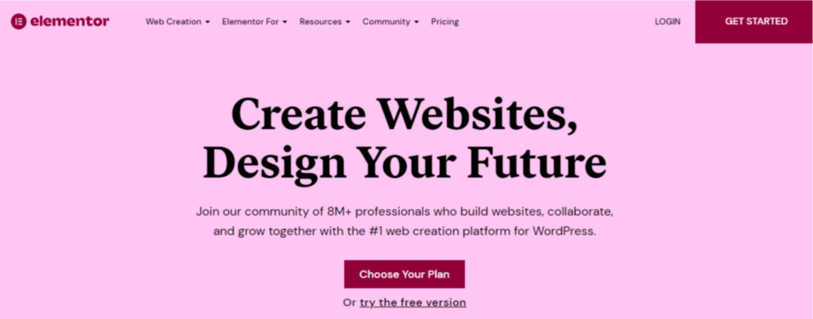
Elementor’s landing page is a perfect example of a compelling landing page. Because it has everything that makes a landing page excellent and engaging. It contains a problem-solving headline along with it a video just after the headline that shows how it works. Besides, its landing page content is informative and problem-solving.
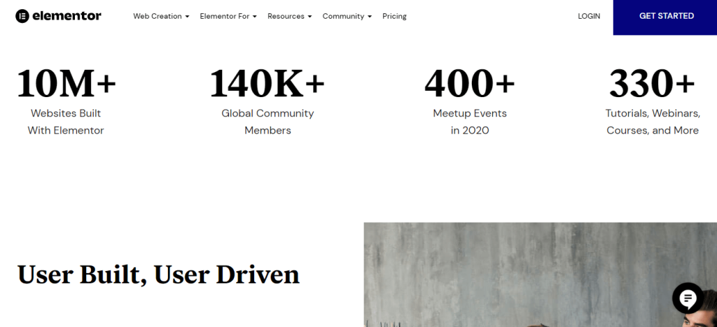
The best part of their landing page is after scrolling down, you will get to know how many websites are built with Elementor and the number of their community members, meetup events, and tutorials or webinars.
This information increases the credibility and authenticity of a product. Moreover, they have used testimonials and CTA on their landing page properly. Also, the design of the Elementor landing page is simple and soothing.
DoorDash:
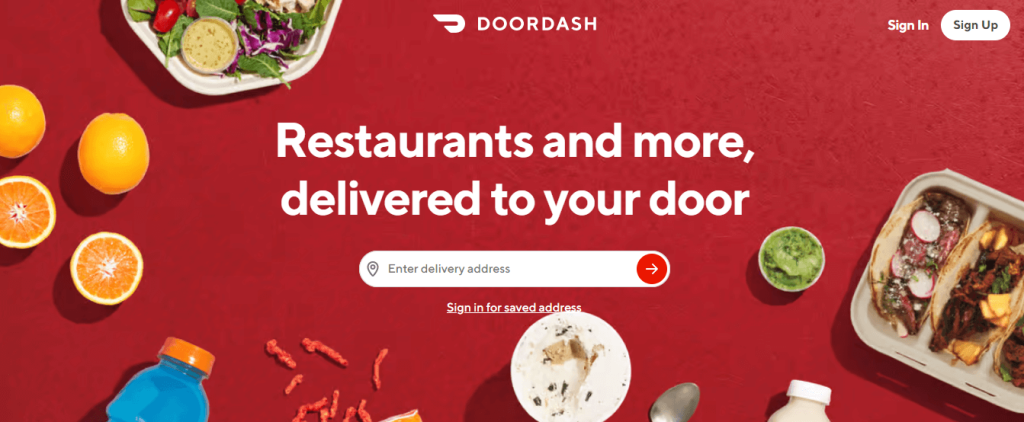
DoorDash is the landing page of a food delivery company which anyone can find out after entering their landing page. They have used food images everywhere on their landing page. Besides, the headline is straightforward. After reading its headline, anyone can understand what service they will get from this site.
Moreover, they have used minimal content on their landing page which increases the readability. Other supporting headlines on the landing page are just like the main headline- simple yet problem-solving. The color and design of DoorDash are perfect and go with the image of the brand.
Webflow:
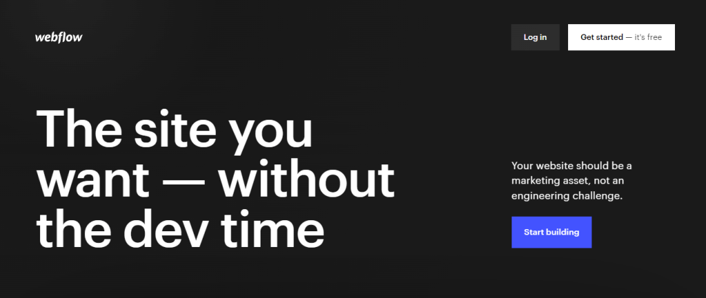
Webflow is another example of a simple landing page. The main attraction of their landing page is the first image that changes with each scroll. Through this image, a visitor can get multiple ideas about their product or service. Besides, they have used larger-sized text on their landing page to grab the attention of their visitors.
Furthermore, visuals on their landing page add uniqueness, and so does the placement of those. Also, it is easier to find out the popularity of their product or service as the number of users is mentioned at the top of their landing page. On its landing page, you will find powerful testimonials that can boost customers’ trust.
Earlybird:

Earlybird is a landing page of a capital investment company from where you will not only get financial resources but also get strategic support. They have used bright colors on their landing page for indicating the shining future. As it is a capital investment company, it focuses more on sharing the information of its founders.

Earlybird didn’t forget to share its business success story on the landing page which makes them more reliable. Apart from this, a sticky header section makes it easy to navigate other pages. Finally, it can be said that it is a perfect example of a beautiful and engaging landing page.
Freshly:
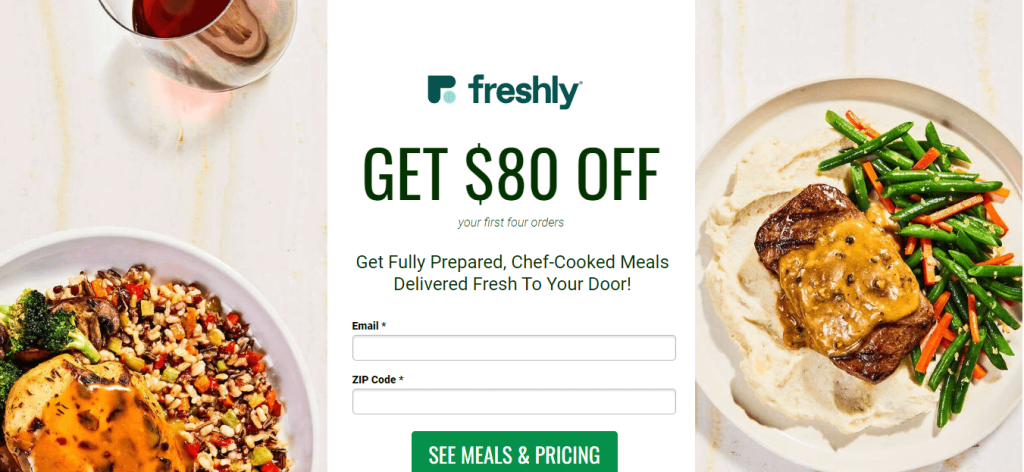
It is another landing page example of a food delivery company. The design and color of this landing page are clean and soothing. They have mainly drawn the attention of visitors by adding delicious food images on their landing page. Besides, attractive food reviews are added at the top of the landing page which is making the landing page more converting.
In addition, the headline, sub-headlines, and landing page content of Freshly are just on point. The most attractive part is they are giving discounts for the first four orders which eases lead generation and conversion. Furthermore, adding only one CTA on their landing page is making it super easy for the visitors to act.
EF Ultimate Break:
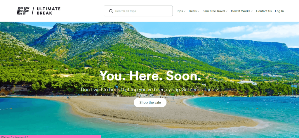
EF Ultimate Break is a landing page of a travel agency that has used alluring traveling pictures on its landing page. Besides, their headline is enough to convince someone for booking a trip. They have focused on the images much more than the text.
Apart from that, customers’ testimonials are nicely presented on their landing page. The landing page of EF Ultimate Break gives the vibe of tranquility that is necessary for a landing page of a travel agency. They didn’t capture visitors’ attention by adding unique designs, instead, they used images of nature that influence visitors for conversion.
Netflix:

Netflix is a streaming service that anyone can figure out through its landing page. Its headline, supporting text, images everything reflects that. You will find less than 250 words on its landing page. However, it is proven that short landing page copies convert better than long ones in the media and entertainment industry. Netflix has exactly applied that strategy on its landing page.
Moreover, they used bolded text to increase the readability of landing page content. Furthermore, the call to action button on the landing page is clear and easily grabs the attention of visitors. Overall, it’s a great example of a streaming service landing page that converts well.
Airbnb:

After entering the hosting landing page of Airbnb, you will get a feeling of hospitality from people in different areas of the world. If you have a place to rent, then it will convince you to become a host by showing attractive estimated earnings. Also, they tried to communicate through images, not words. That’s why you will see minimum content on their landing page.
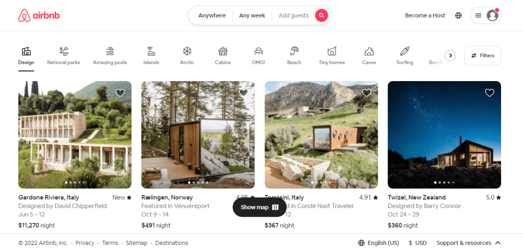
The landing page for tourists is also excellent. Tourists can easily choose their homes according to their budget. Besides, its landing page design is clear and concise where different types of home categories are added to provide the exact vacation home they want. Without any doubt, this is one of the best landing page examples.
SEMrush:
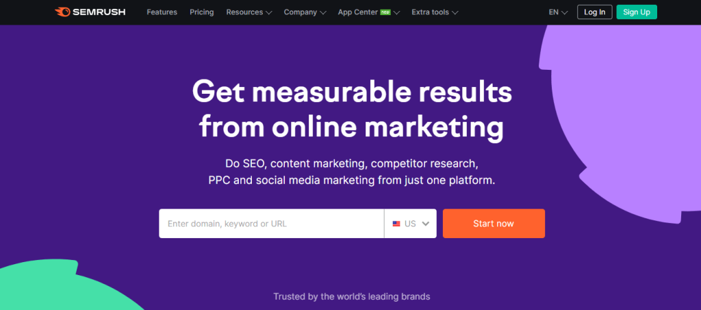
SEMrush can be another example of the best landing page because its design, landing page copy, and CTA button all are on point. The hero area of SEMrush gives an idea about its service. You don’t need to scroll down. Besides, its landing page copy is very informative and conveys a clear message.
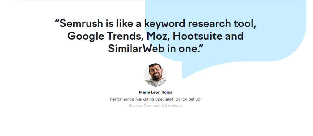
Also, noticeable customer reviews are added to its landing page which is hard to ignore. Likewise, information on users, achievements, and growth are nicely presented on its landing page, making it a converting landing page.
Perfect Keto:
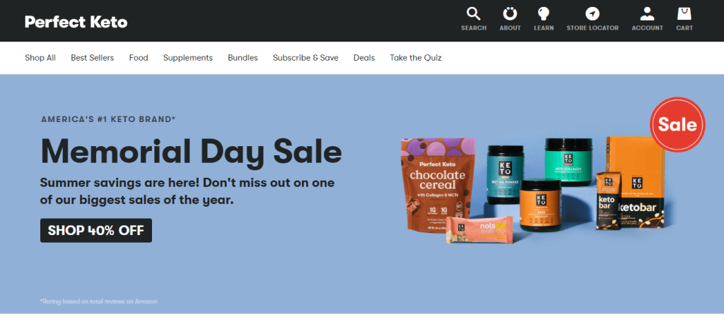
It’s the landing page of an American keto brand where you will find keto supplements. The landing page of Perfect Keto will give you a clear idea about what type of product or service you will receive from there. The design and color of the landing page are simple yet attractive which perfectly goes with the brand.
On top of that, they have nicely promoted their products with reviews and ratings on their landing page. This will easily convince anyone to buy their products. The proper use of color, design, image, and content reflects on their landing page which makes it the another best landing page sample.
There are many famous websites that you might not know. You can also check out the landing pages of those. Read out the blog:
⭐. 11 famous WordPress websites that you didn’t know.
How to build a powerful landing page?
The purpose of building a powerful landing page is to increase conversions so that your business goals can be fulfilled. Now to create a converting landing page, you not only need to focus on the key elements of a landing page but also need to choose the best tools.
The good news is that you don’t need to struggle much to create a dynamic landing page as now you can build it with the easiest drag and drop feature of Elementor and ElementsKit. Besides, these are the best page builders to create your landing page effortlessly.
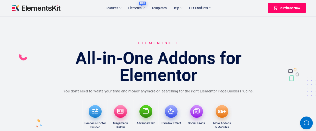
Elementor is an excellent website builder where you will find various widgets, a drag and drop editor, and pixel-perfect designs. And using an addon like ElementsKit increases the functionality of Elementor and hits its page-building potential to the fullest. ElementsKit is an all-in-one Elementor addon that offers 85+ widgets, 8+ modules, and lots of templates to create a wonderful landing page within a few minutes.
Even, lots of top-ranking websites are built with ElementsKit because of its features and benefits. To cut long story short, it can be said that Elementor and ElementsKit are the best combinations for creating a powerful landing page.

Wrapping up:
Since you have figured out what makes a landing page great and also, check out the best-performing landing page examples, now it’s your turn to make one. Don’t hesitate to build your landing page. You might find it hard if you don’t choose the right landing page builder and WordPress theme. So, select the most suitable page builder to make your work easy.
Elementor and ElementsKit are the most user-friendly tools. Besides, you don’t need to learn code to use these tools. Moreover, these tools are optimized for SEO and loading speed which will let you build a successful landing page within a few hours.
